Primato

Primato

Pure smaakmakers.

Branding, Design

THE BRAND CHALLENGE

Primato operates two state-of-the-art greenhouse locations in Putte, Belgium, where they grow specialty tomatoes combining advanced technology with family business values. Their team of passionate growers produce exceptional quality tomatoes with distinctive character.

But their brand identity didn't reflect who they truly are. In a market where tomato growers either compete on industrial volume or nostalgic small-scale craft, Primato needed a brand that could communicate their unique position: the consistency and innovation of high-tech cultivation combined with the soul and care of a family business.

Primato-social06
Primato-social04

OUR ET ALORS? MOMENT

our et alors? moment

What if we stopped treating tomatoes as a commodity and instead positioned them as a craft? Could we create a brand identity that makes people taste the difference before they even bite into the tomato?

The insight: Primato doesn't just grow tomatoes. They're smaakmakers: people who take responsibility for creating the best possible taste. That mindset, that culture, that pride. That's the brand.

Primato-social509
Primato-social02

THE BOLD SOLUTION

the bold solution

We built Primato's brand from the ground up. Strategic Foundation Complete brand positioning framework with mission, vision, and values. Brand essence: "Pure smaakmakers." Tone of voice: confident but humble, warm but professional. Four key differentiators that set them apart: the smaakmaker principle, innovative yet intuitive approach, Belgian character, and specialty expertise.

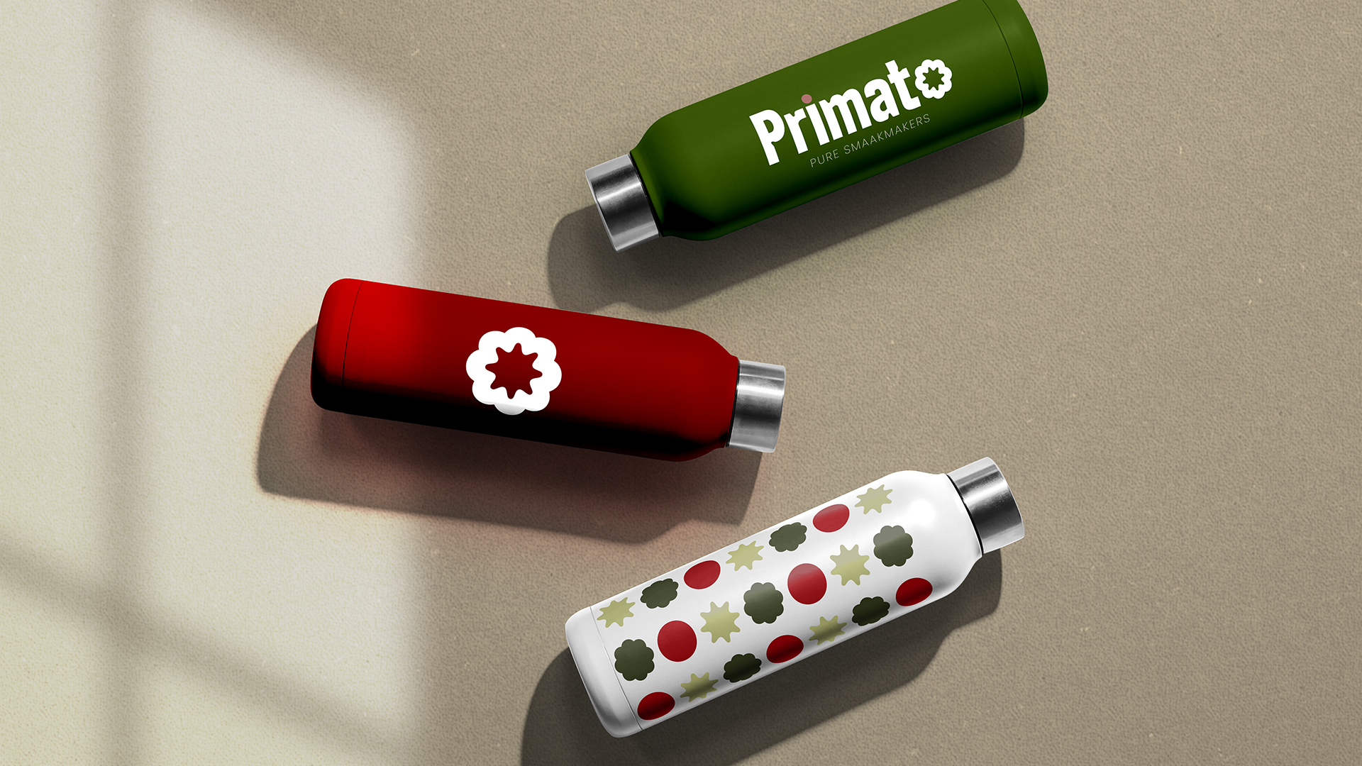
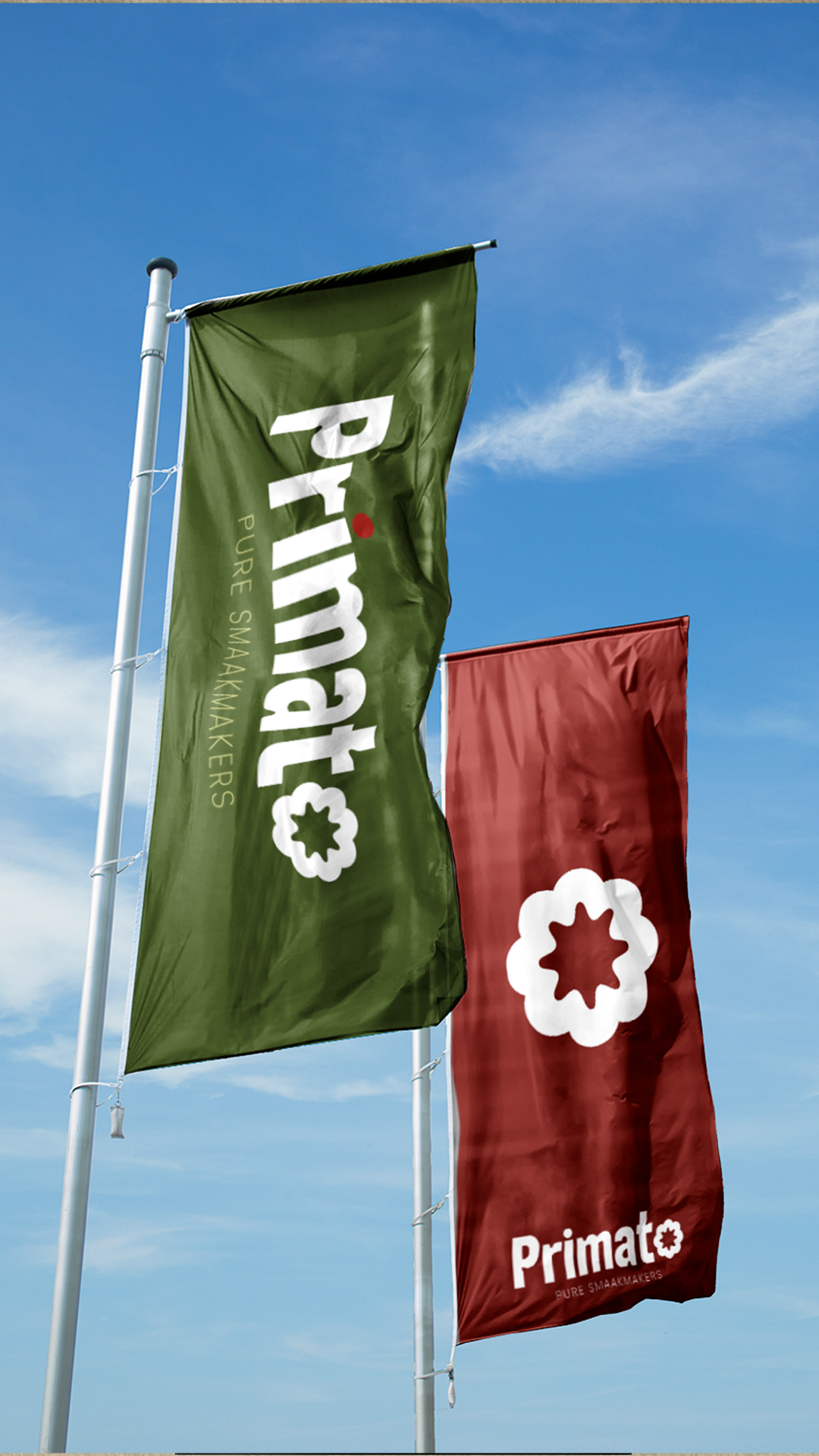
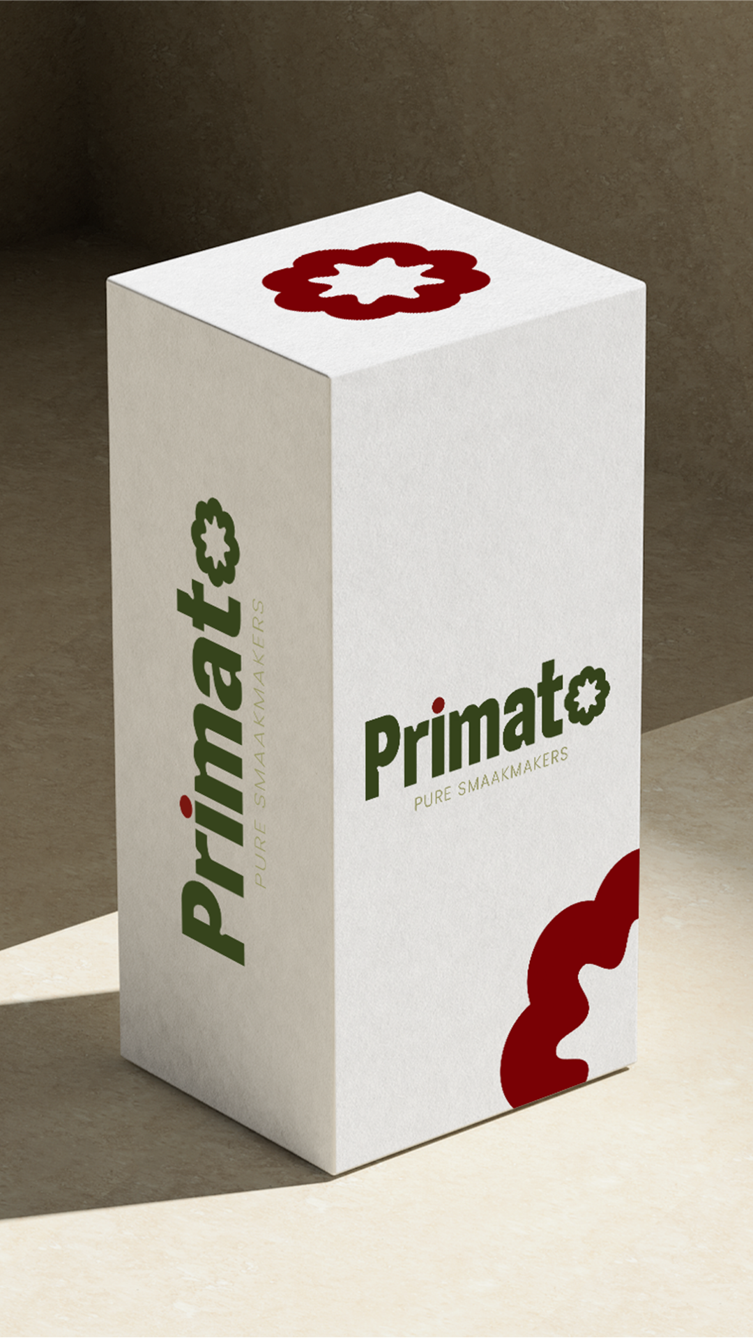
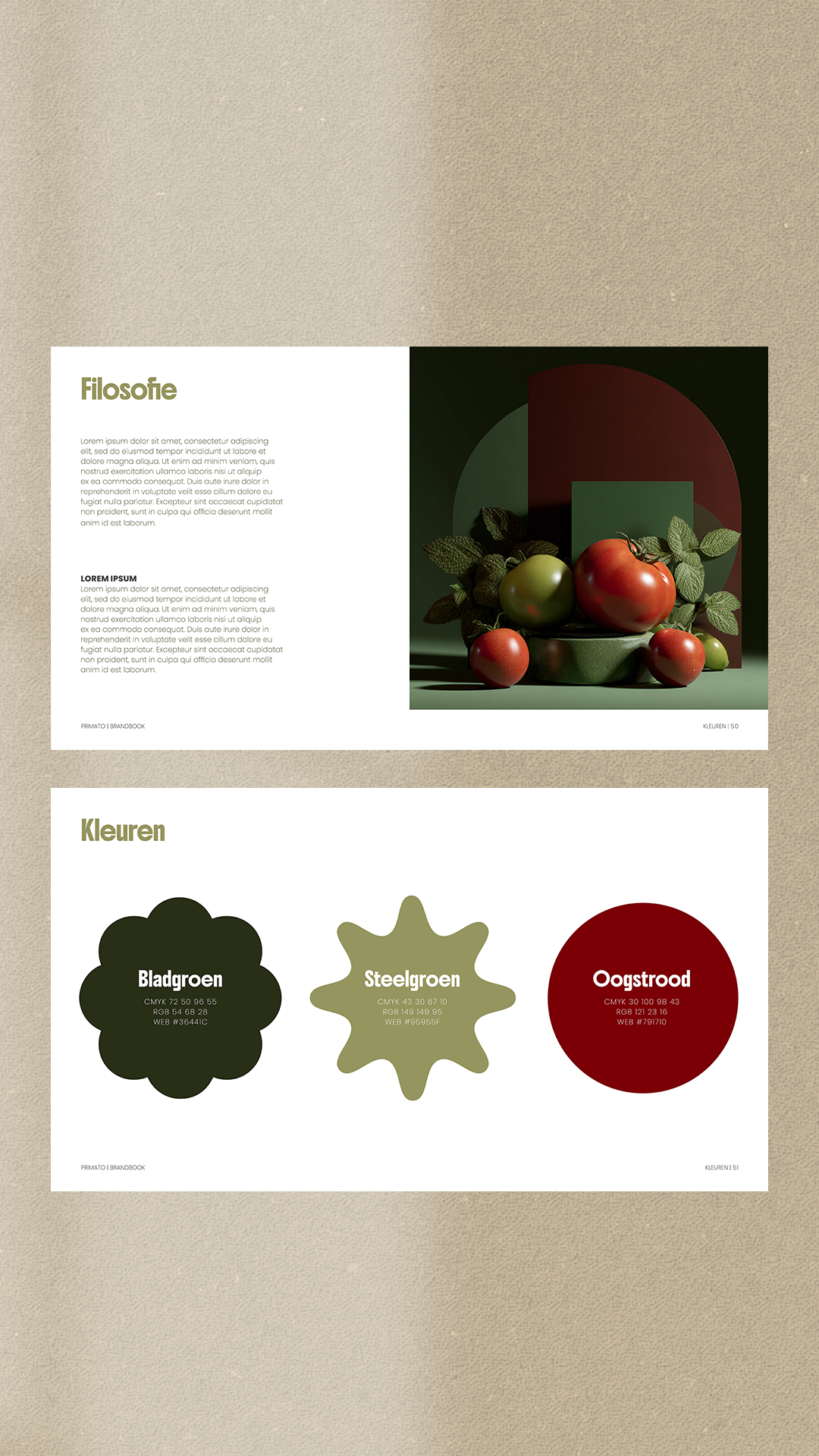
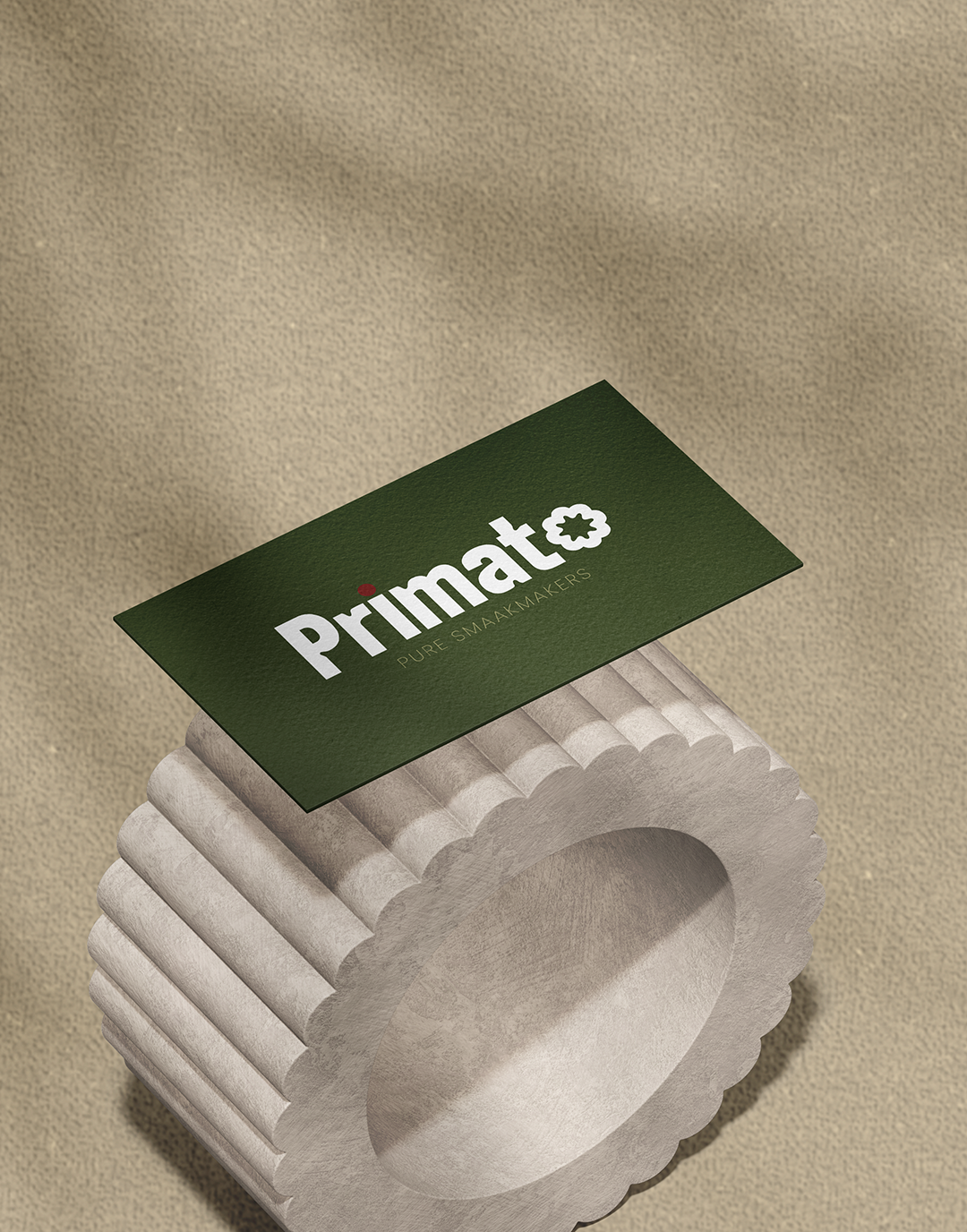
Visual Identity Custom logo with tomato crown as signature element, subtly integrated into the typography itself. The 'o' forms the central anchor with the crown in negative space, returning throughout the wordmark. Color palette rooted in nature: leaf green, stem green, harvest red. Typography that balances strength and accessibility. Graphic shapes and pattern systems for flexible applications.

Brand Book & Guidelines Comprehensive guide covering brand story, logo usage, typography, color philosophy, graphic elements, tone of voice, and the smaakmaker culture. Plus clear strategy for managing their two locations under one strong master brand.

The result is a brand that communicates quality, craft, and character at every touchpoint. A brand where you can taste the difference, just by looking at it.

The result is a brand that communicates quality, craft, and character at every touchpoint. A brand where you can taste the difference, just by looking at it.