(01)
THE BRAND CHALLENGE:
Develop a complete brand identity for an inspection company fighting consumer exploitation through transparency and straight talk—starting with nothing but a name and a mission.
(02).
OUR ET ALORS? MOMENT:
How do we make a technical service feel trustworthy yet approachable? What if we built a brand that turns inspection anxiety into confidence?
(03).
THE BOLD SOLUTION:
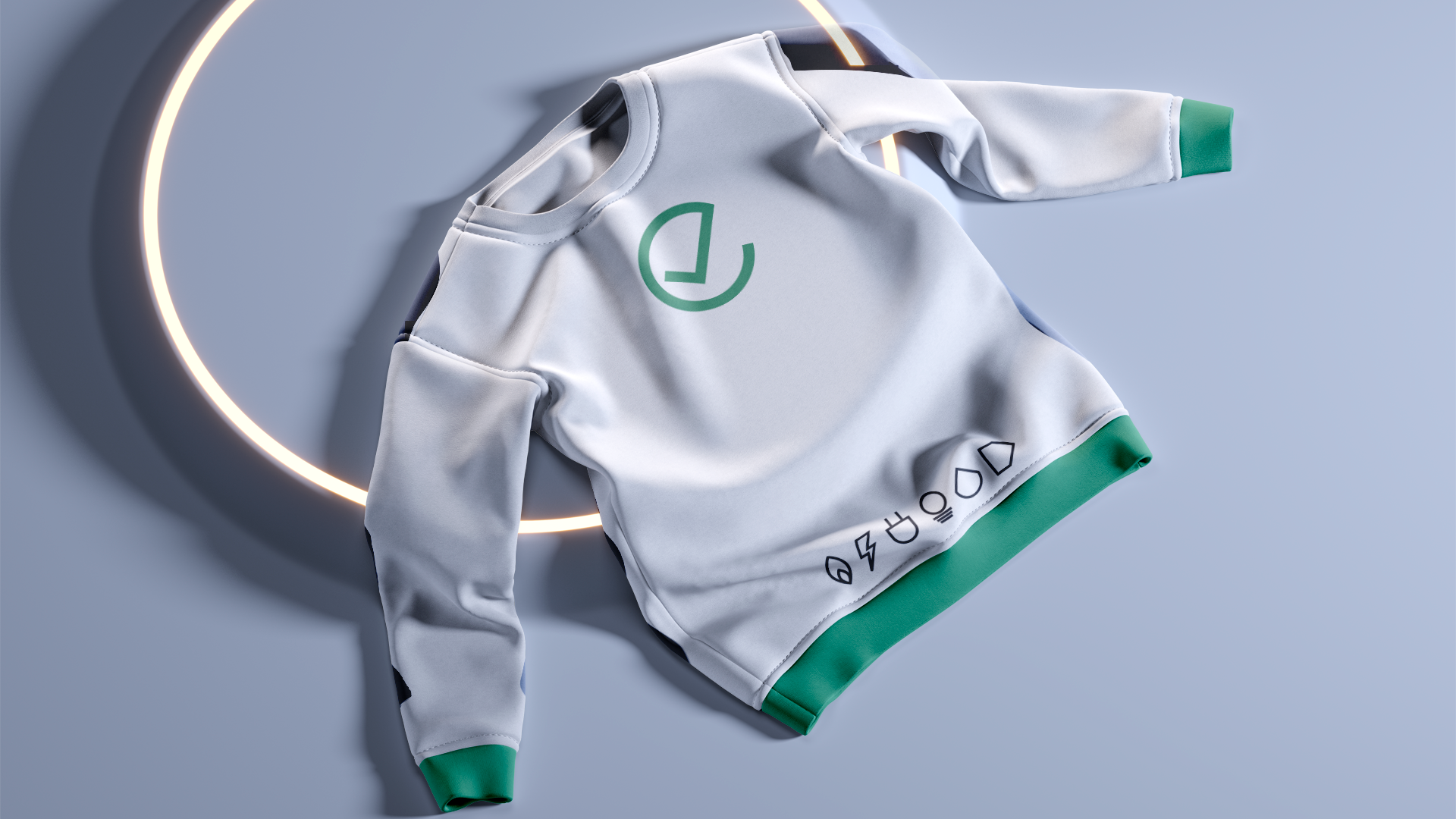
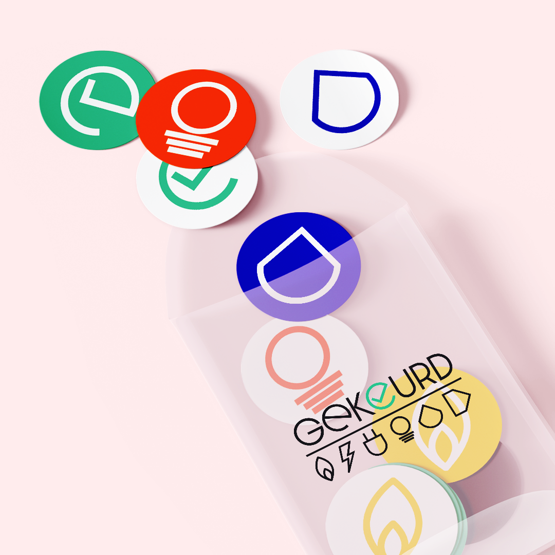
A versatile, multi-layered logo with subtle references to the utilities they inspect, paired with a typeface featuring just enough roundness to feel human. The color palette combines soft grass green (signaling freshness and vitality) with warm gray (providing authority without coldness). The result? An identity that feels established enough to trust but progressive enough to champion consumer rights.


